Golden Gate Bridge

Bridging the Gaps Between Transportation & Tourism
The Golden Gate Bridge, Highway & Transportation District knew that it needed a new visual identity for its website, but weren’t sure where to begin. FFW helped it understand its needs and determine how best to design outstanding digital experiences for locals and tourists alike.
Last year, 38 million vehicles crossed the Golden Gate Bridge and over 9 million customers rode the transit systems. Millions more visitors came to or crossed the bridge each year, and those who tried to find information online before arriving were frustrated by an antiquated, clunky website. The District knew it needed a new visual design, so it contracted FFW to prototype a stunning new visual direction that would offer an enhanced user experience. Note: this new design is currently not yet live on their website.
Understanding Content Chaos
The District determined that its website, goldengate.org, was outdated and difficult to use. It had grown organically over time, leading to content chaos, and the site itself lacked focus. The District serves both commuting locals and sightseeing tourists, and this duality was in conflict on their website. It was extremely difficult for their disparate audiences to find targeted content, either through search or through browsing. In addition, the site itself was visually unappealing, and the District did not feel that it reflected its organization.
FFW conducted four workshops with 25 internal stakeholders across various departments at the District. Workshops were facilitated discussions combined with exercises and surveys, and were structured around understanding the current problems with the site, determining target audiences, reviewing industry websites, and reassessing the branding for the District. During the four workshops, three key themes emerged:
Information Architecture and Findability
Organic growth had led to messy, unprioritized content that made it difficult for users to find the information they need.
Transportation and Tourism Duality
The Golden Gate Bridge is not only one of the most recognizable landmarks in the United States, but is also utilized by commuting locals. These two different audiences have disparate needs, and there is no clear content targeting for each audience on the site.
Visuals and Dynamic Content
The site was considered to be visually outdated and unappealing, and the appearance of the site was not felt to reflect the modern values of the Golden Gate Bridge, Highway & Transportation District.
Designing a New, Beautiful Digital Space
After uncovering the three clear pain areas, FFW compiled recommendations that provided the Golden Gate Bridge, Highway & Transportation District with a clear list of initiatives that would be needed to update their website. In addition to prescribing specific functionalities for the new site, FFW designed a four-page prototype of what such a site might look like.
Visual Appeal
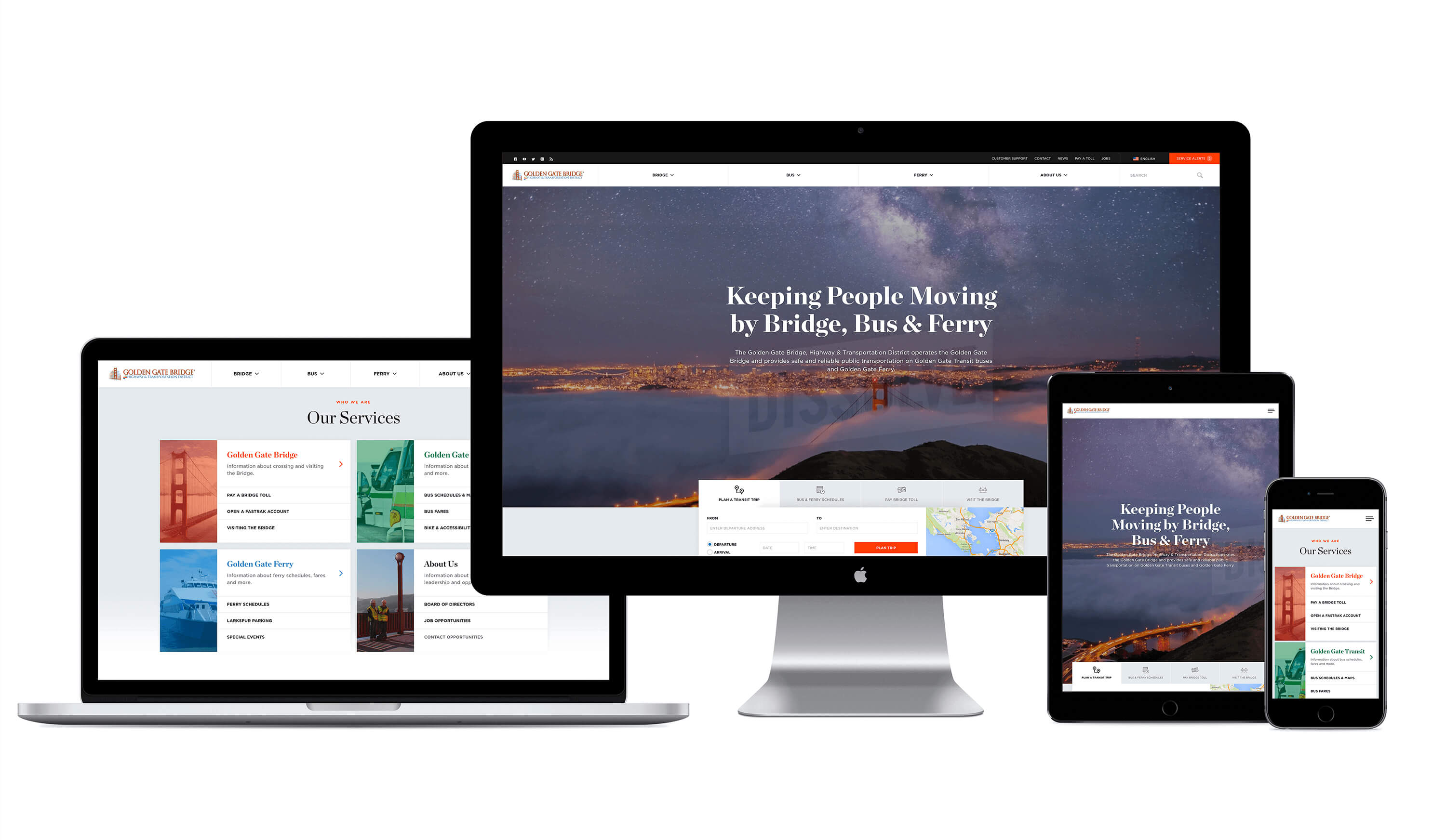
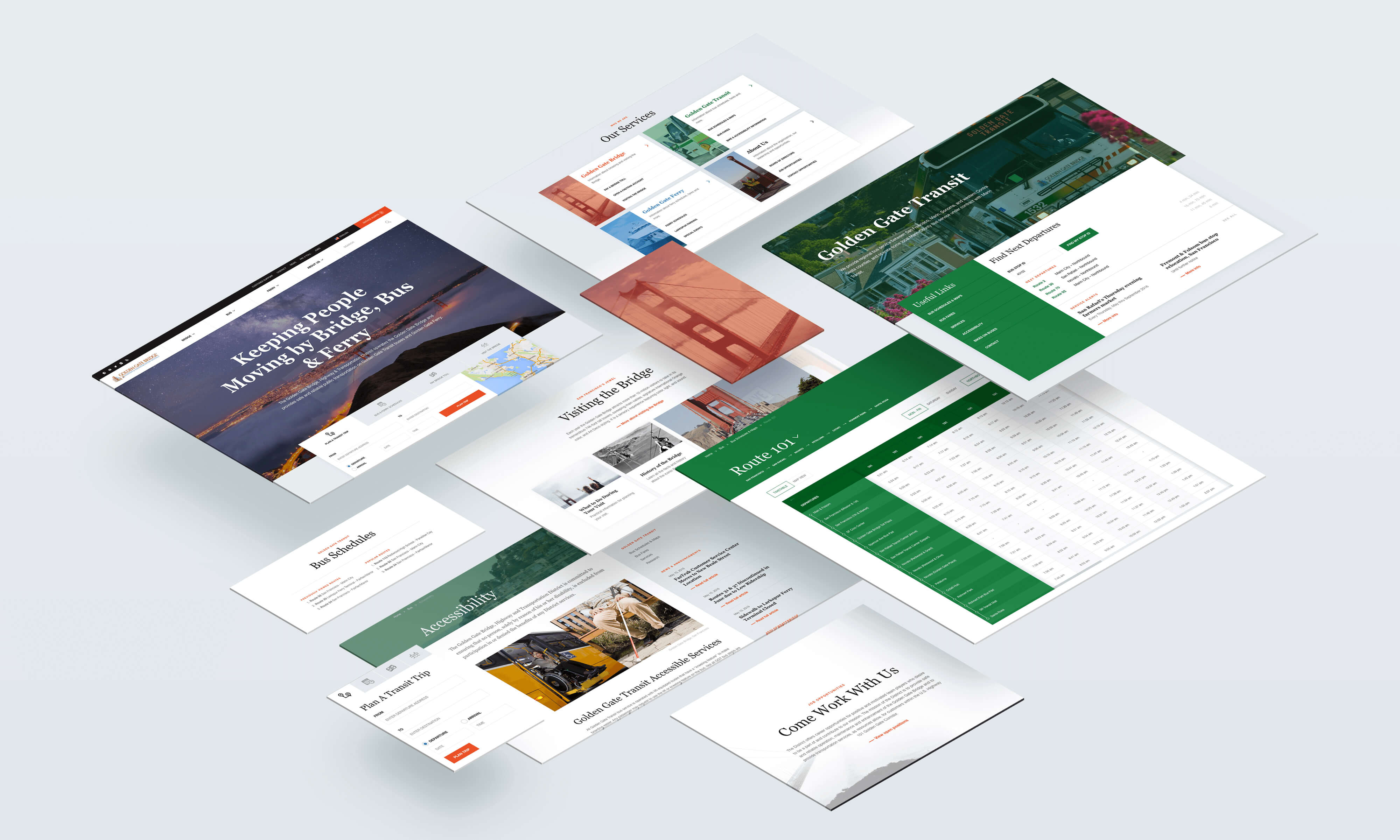
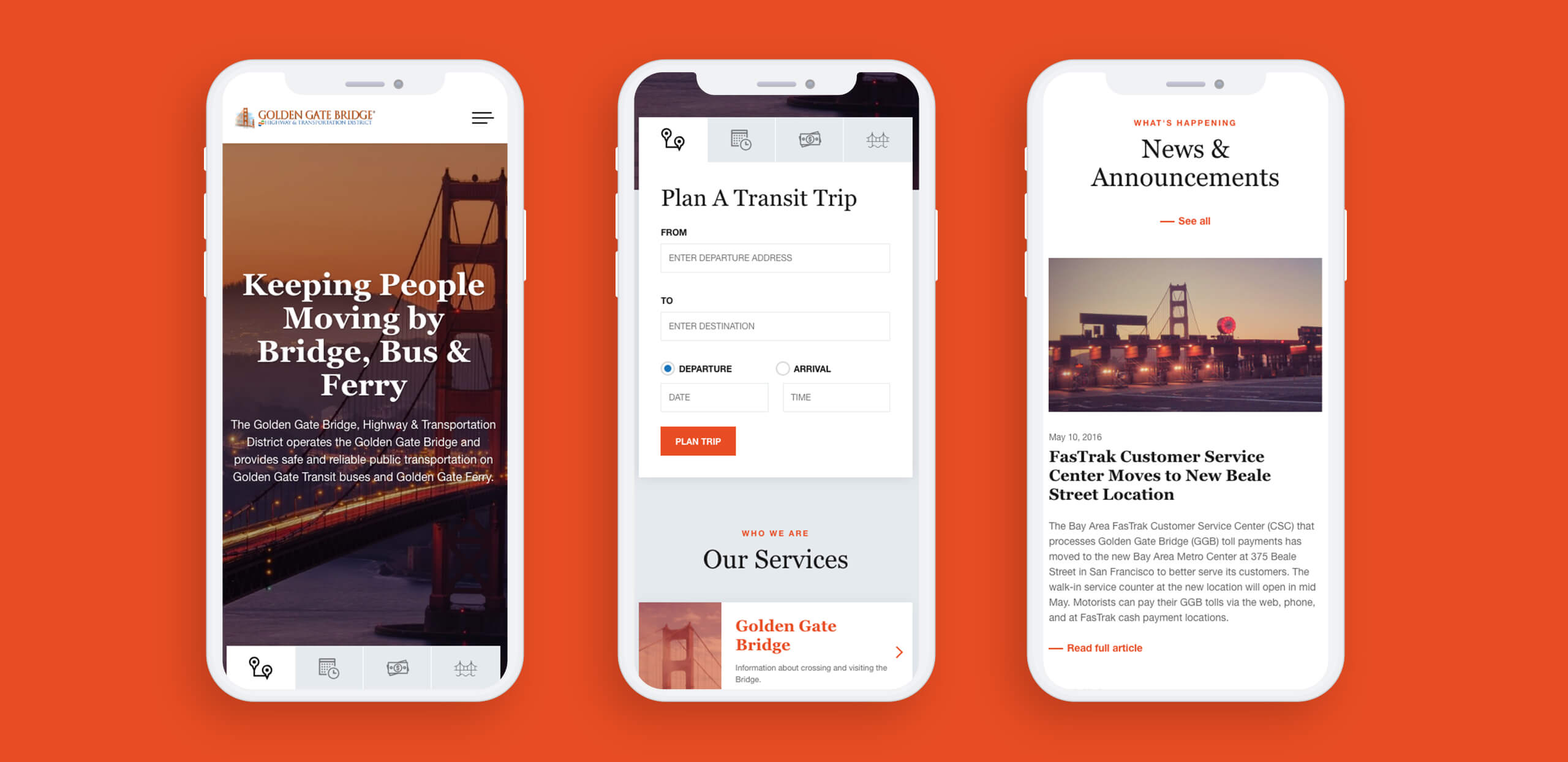
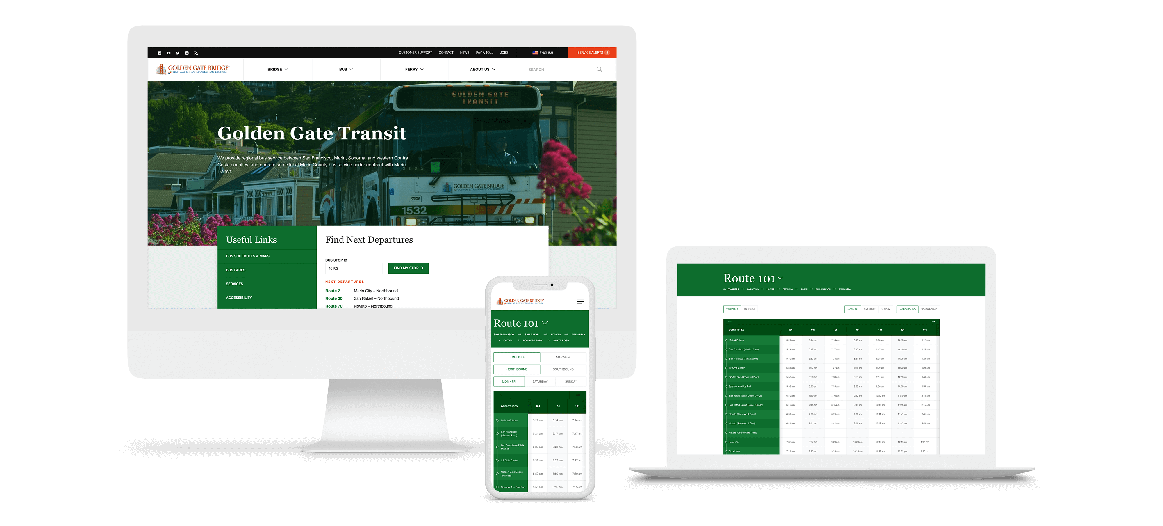
The prototype was updated to be clean and visually engaging. With large pictures of the bridge and various transit services, and a crisp design, the prototype brings a much-needed modern edge to the District’s online presence. In addition, FFW drew up clear branding guidelines for the District to use, to help create a crisper, more cohesive user experience.
Easy Navigation
The workshops yielded a tremendous amount of information about the wide variety of people who visit goldengate.org. This helped FFW take a user-centered approach to rethinking the District's site. Understanding who visits the site, why, and what’s important to them led the design team to break the new site’s structure into clear user journeys that prioritize information in a way that is useful and easy to navigate.
On the front page of the prototype, site visitors are immediately presented with easy-to-access information about planning a transit trip, viewing the bus and ferry schedules, paying the bridge toll, or visiting the bridge for sightseeing. The site menu itself breaks content into clear categories: ‘Bridge', ‘Bus', ‘Ferry', and ‘About Us'. Throughout the site, visitors are offered clear navigation options that siphon traffic into clearly-defined information pathways, and content has been prioritized for ease of use.
There are numerous further recommendations that have been defined, though not-yet implemented in the prototype, including a stronger search functionality, and the inclusion of dynamic content such as a webcam feed.
The District was thrilled with the results, and is currently using FFW’s list of recommendations as the basis for a full redesign project. The updated site has not yet launched.