The State of UX Design — thoughts on designing digital products
User experience design has come a long way since Don Norman coined the term in the 90’s. It has gone from esoteric industry terminology to a being one of the most in-demand disciplines in the technology sector — in only a matter of years. “UX Designer” is one of the 10 most popular job titles that barely existed 5 years ago with an explosive 22x growth since 2008. And the demand for UX Designers in the job market seems to just keep on increasing, with thousands of open job positions worldwide.
There can hardly be any doubt; UX Design is all the rave. So what better time to take a step back and assess the state of the UX Design field?
So what is UX Design, really?
In recent years, the UX community has seen many a discussion about the definition and boundaries of UX design.
At one end of the spectrum, many seem to focus the term “UX design” around user research and information architecture. This makes a lot of sense — certainly, these disciplines play an integral role in ensuring a good user experience in a digital product. Additionally, these disciplines are related to a lot of tools and methodologies that have come to be closely associated with the UX Designer: personas, use cases, wireframes, and so on.
At the other end of the spectrum, we occasionally find the term UX design used almost interchangeably with User Interface (UI) Design. And while this tendency has been criticized thoroughly — even lividly — I can personally just as easily sympathize with this idea: if the actual interface and interactions of a digital product is not pivotal for the user experience, then what is?

But although I can personally relate to both these definitions of UX design, I also think they share the same flaw: they’re both reductive in their attempt at restraining the term “UX design” to a certain set of tools or a certain part of the design phase.
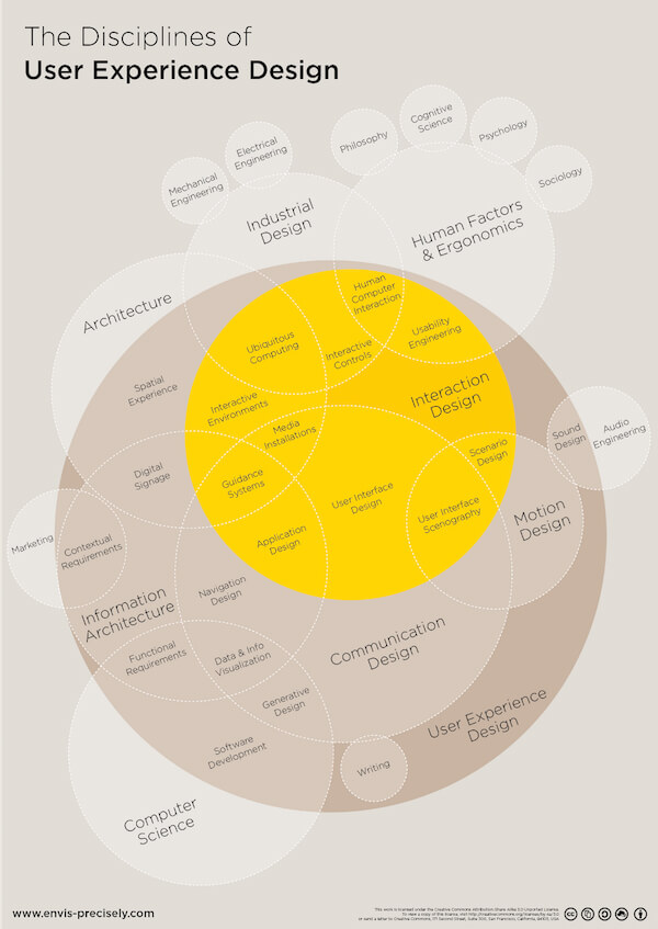
The fact of the matter is that UX design is not one discipline. UX design is a multidisciplinary approach to designing digital products, and it encompasses a number of disciplines. Information architecture, interaction design, UI design, usability — really any discipline related to shaping a user’s experience of a given digital product falls within the boundaries of UX design. “UX design” is an umbrella term.
UX design as a mindset
Operating within a field as broad as UX can be scary. The many disciplines involved in UX design can make even the most talented professionals feel inadequate. What kind of unicorn could possibly master all these skills? So in an attempt to communicate more clearly which of the UX disciplines, each of us are specialized in, we’ve seen a plethora of UX job titles appear alongside “UX Designer”: UX Architect, UX Consultant, UX Specialist, UX Researcher, UX Developer and so on.
One might argue this shift towards UX-related job titles is simply a matter of marketing — i.e. “UX” is trendy, and we all want a piece of the pie. A very persuasive argument can even be made that the term “UX Design” is just a fad, and that sticking with titles such as Information Architect, Design Researcher, Visual Designer or Interaction Designer would be a much better way to distinguish between specializations.
There may certainly be a lot of truth to this criticism. But to me, the rapidly rising popularity of the term “UX design” (and the job titles that go with it) are also symptomatic of a highly positive trend; the professionals working with the design of digital products are becoming increasingly aware of the importance of involving oneself in the entire design process.
Rather than caring too much about roles and titles and responsibilities, UX Designers are beginning to focus on what’s important: the users and their experiences. To design great products for our users, we can’t just be cogs in a wheel — we have to care about and involve ourselves in the entire design process, from research to design to development. To me, UX design as a term and field is enabling this development. Being a UX Designer is more about a set of traits than a set of tools. We’re breaking out of the silo mentality, and coming together in a shared mindset.
Bridging the gaps between UX disciplines
That the UX mindset is creating a less “silo’ed”, more fluid design process seems to shine through in a lot of the discussions and developments that are going on in our community. New approaches and new tools appear almost daily, and some are quickly becoming industry standards. And it seems to me, that all these new toys are contributing to steadily bridging the gaps between the the various disciplines under the UX umbrella.
Allow me to give you a few examples.
Example 1: Sketch.app as a bridge between wireframing and UI design
There is no doubt that Sketch by Bohemian Coding is quickly becoming an industry standard for interface design, thus providing some (much needed?)rivalry to Adobe Photoshop. But while much has already been said about the merits of Sketch as a tool for UI design, another important aspect seems to be its potential for bridging the gap between various UX disciplines.
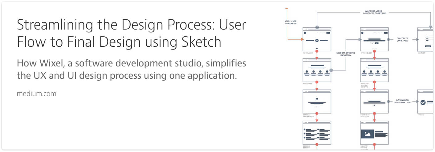
I recently spoke to a close friend of mine, who works as a UX Architect at a digital agency. She was telling me about their transition to using Sketch. Previously the handoff from wireframing to UI design had been complex process for them. Wireframes were typically done by UX Architects in Axure, before being handed of to UI Designers that would rework them in Photoshop. But with Sketch, they have found a tool that bridges this gap, and allows them to work much closer and much more iteratively together.
As opposed to Photoshop, Sketch is simple and intuitive, and provides just the right set of vector-based tools, that makes it perfect for wireframing. And the UI Designers are able to collaborate on the same files, adding visual design and details in Sketch, which would have been impossible to do in Axure. For my friend, this has been a major improvement to her workflow, allowing for a much better collaboration between the people in her UX team, and ultimately; much better UX on their products.
And apparently, my friend and her team is not alone in using Sketch to improve their UX workflow:
That’s it in a nutshell. One app, one streamlined system to deal with UX, wireframing and final design.

Example 2: Prototyping tools as a bridge between UI design and interaction design
User interfaces should be responsive and transitional — meaning that they should react to the user’s interactions in a clear, understandable and useful way. Designing interactions carefully can be key in enhancing the overall UX. As such, interaction design is a major component of designing digital products, and the importance of designing engaging animations and transitions in interfaces is currently a hot topic in the UX community. This is also evident in the digital landscape. Major companies are building large parts of their design languages and principles around the use of meaningful animations and transitions — like Google’s Material Design or IBM’s Design Language.

Example of “Web Drawer” animation from IBM Design Language.
New tools for designing interactions and transitions are bridging the gap between UI design and interaction design. Tools such as Invision and Marvel allow UX designers to easily prototype and test the flows and interactions of their UI. Linked Sketch or Photoshop files are automatically sync’ed and updated on changes, which allows for a fast and truly iterative workflow. For designing more complex interactions and animations, tools such as Pixate or Form provide the granular control needed.
Example 3: Designing with code as a bridge between UX and front-end development
Digital products are both interactive and dynamic. So in order to create an optimal UX, neither showing nor telling is sufficient; UX designers should be able to feel and test exactly how the user will experience the actual product. At FFW we often use a variety of the tools mentioned above in our UX process to achieve this goal — but when possible, we prefer to design with code.
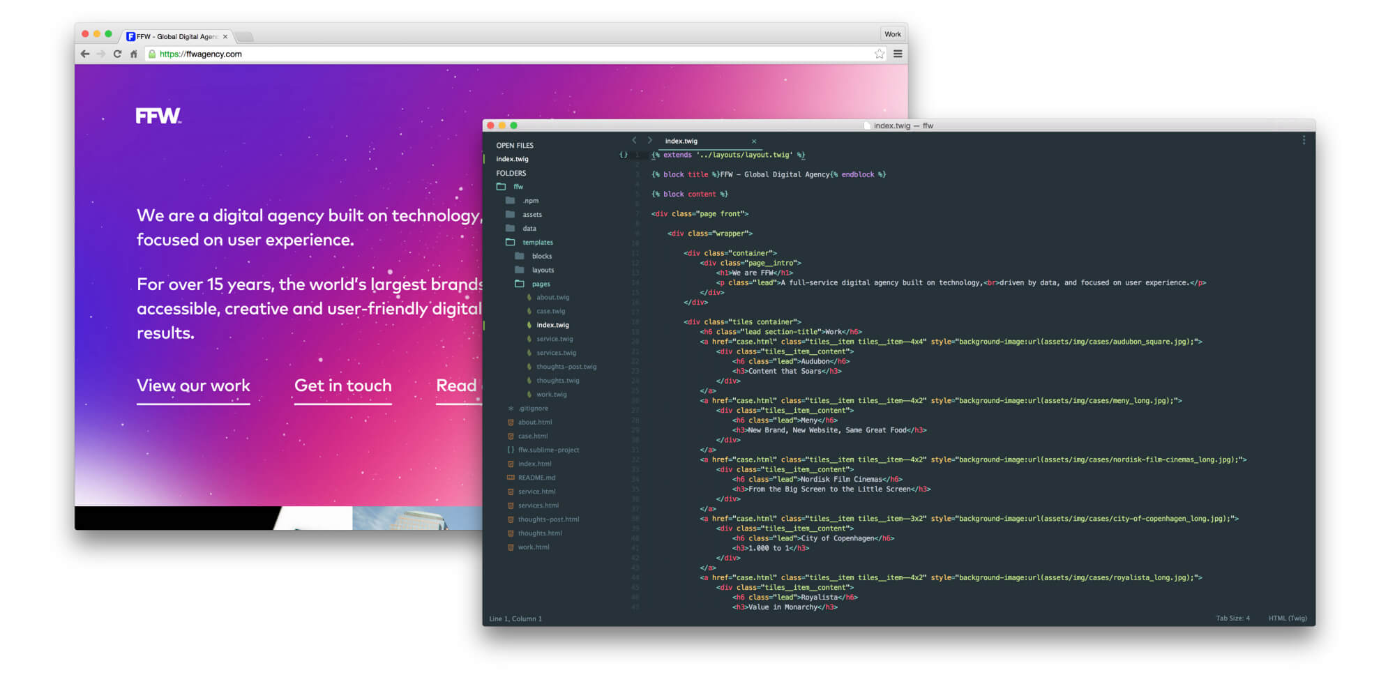
Designing with code is becoming an increasingly popular practice in the UX community. By skipping static mockups and instead creating designs and prototypes directly in code, designers are able to design and test all the details of the UX, including user flows, transitions, states and interactivity, in all the various mediums and platforms. Coded prototypes allow UX designers to test their every design assumption with actual users. People can see, click, swipe, tap, scroll and experience exactly how the product is supposed to work and behave.

There are plenty of great open source frameworks for designing with code and creating prototypes in-browser, such as Headstart, Roots or Web Starter Kit — but another option is obviously to “roll your own”. (In a future blog post, I’ll elaborate more on the setup that we have chosen to go with.
All these frameworks bring together a number of best practices and useful front-end tools to create an ideal starting point for quickly putting together prototypes. This not only helps to bridge the gap between UI design and interaction design , but potentially also between UX and front-end development. Developers are able to follow along in the entire UX process, and can reuse all (or large parts of) the code in the final product.
But what about those UX designers that are not proficient in code?
Luckily, a number of new tools are appearing that enable designers to create semantic, well-coded prototypes — without necessarily writing any code themselves. These “codesign” (code + design) tools give UX designers a familiar visual interface to work in, manage responsive breakpoints and add animation and interactivity, and then automatically generates the corresponding code. The less code-savvy UX designers at FFW have used Webflow extensively — and to great success — , but other options includeMacaw and FROONT.
So then — what is the state of UX design?
While “UX design” as a field and a term can certainly be accused of blurring boundaries and making it difficult to distinguish between the disciplines, I think that it may just as well be applauded for bringing them together.
UX design is a multidisciplinary spectrum, and few UX designers span the entirety of it — but the spectrum allows us to break out of the silo mentality and establish a common mindset.
I think we’re really seeing the effects of this. Despite varying “UX xyz” job titles and individual areas of focus, new tools and methodologies are bridging the gaps between the various disciplines under the UX umbrella. Tools for information architecture, for visual design, for prototyping and for coding are allowing UX designers to collaborate more easily, and are creating much more rapid and iterative workflows.
This is great news; for us in the UX field, and for the users that we’re designing for.
I can’t wait to see what the future will bring.
