Pushpay

Pushpay had developed two different sites: Pushpay.com, which was the high-tech home of the Pushpay product, and eChurch.com, which was Pushpay’s main marketing platform and was targeted towards American churches. During a digital transformation effort in the spring of 2018, the Pushpay team made the decision to combine the two platforms and unite their different brands. The company contracted FFW in June 2018. The Pushpay team wanted to have the work done in time for an event in August 2018, and FFW was delighted to rise to the challenge of quickly producing a world-class site. A mixture of onsite collaboration and daily check-ins allowed us to work in real-time to design and deliver Pushpay’s dream solution on their ideal timeline.
The Challenge
- Unify two distinct brand identities with very different user bases (high tech and religious) under a single go-forward experience design
- Tell “The Pushpay Story” – focusing on real-life customer experiences that showcase how Pushpay helped them achieve goals that were previously beyond their reach
- Needed a secure solution that would protect users’ sensitive information and integrate well with Pushpay’s product
- Deliver a website that reflects and compliments the premium solution Pushpay offers – while demonstrating the value/cost benefit of the premium price
- Consolidation of multiple platforms led to unique challenges with site structure and appearance
The Solution
- A premium Pushpay-branded user experience reflects the quality and value of the product – while driving increased qualified lead generation.
- Component-based design allows for streamlined branding, storytelling, and user journeys
- A static site on an Amazon Web Server ensures that the WordPress CMS doesn’t touch the Pushpay product or data in any way
- Specific URL redirecting patterns allow users to seamlessly navigate between product and Pushpay marketing site without risking security vulnerabilities
Our goal was to unify the Pushpay and eChurch brands, and with FFW’s help we’ve accomplished that and more. We’ve been able to share our story of generosity and community improvement to a wider audience than ever, and it wouldn’t be possible without this new platform.Anthony Gomes - VP, Corporate Communications at Pushpay
Consolidating two disparate brands with one stunning design
Though Pushpay was well-known as the go-to platform for church donations in New Zealand, when it moved to the United States, the team encountered a challenge. The platform was rebranded as eChurch to help get the Pushpay platform a stronger foothold in the digital market for donations, and it was this identity that allowed Pushpay to grow and expand. However, the Pushpay team knew they ultimately had to appeal to both churches and secular fundraising organizations and made the decision to combine the best of Pushpay with the best of eChurch as part of the redesign.
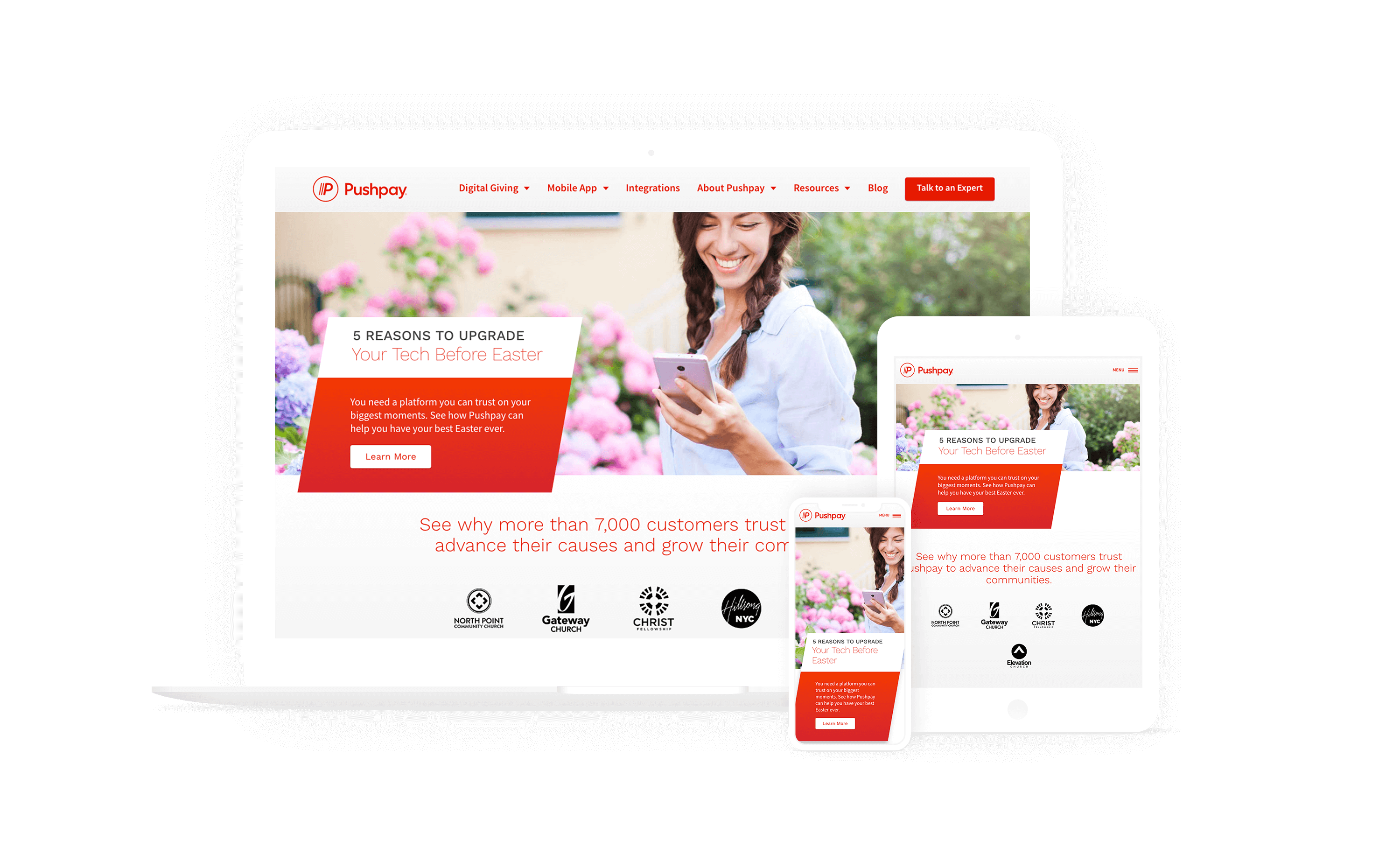
To complete the redesign on Pushpay’s ideal timeline, Pushpay and FFW collaborated onsite in an intensive design session that packed the work of several weeks into several days. The FFW team traveled to the Pushpay offices and set up camp in a conference room, where they iterated on designs, met directly with the Pushpay team every few hours for feedback, and continued to refine. The direct collaboration between the two organizations strongly streamlined the design process and resulted in a beautiful layout and branding that combines all the flagship elements of the Pushpay brand with the warmth and storytelling of eChurch.
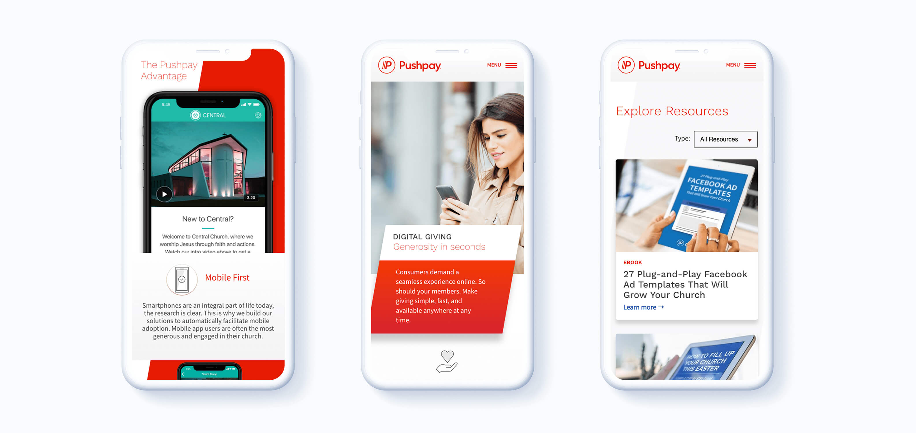
The FFW team built Pushpay a design system of visual components (including typography, iconography, imagery, color, layout, texture, and composition) that worked together to offer a cohesive, visually stunning experience. The design system is not only visually optimized, but technically optimized as well, and uses a striking slash motif and design to highlight the best of Pushpay’s brand across devices.
Storytelling was a central element of the new Pushpay design. Pushpay provides a superior donation gathering experience, and the product is designed to help organizations contribute more and at a higher level to the communities that fund them. Pushpay offers a premium product at premium prices and needed a way to showcase their high worth. The Pushpay product has a track record of genuine, credible success, which led the FFW team to incorporate compelling customer stories throughout every page of the website. Video and text-based testimonials are strategically highlighted at important touchpoints to showcase the value of the product and provides Pushpay’s customers with a way to tell their own stories of success and transformation.

From two sites to a single, rich platform
Prior to the redesign, Pushpay was distributed across two digital platforms: Pushpay.com, the home of their product, and eChurch.com, which was their marketing center and had been designed to appeal to religious organizations in the United States.
Because of their branding and technical separation, Pushpay’s content team was struggling to share content between the two brands, which made consistent messaging and help for users difficult. In unifying the two brands, Pushpay looked to make sure all their content, lead generation work, and production information could be more easily tied and tracked together, while still providing a singular brand experience to all visitors.
To target their product to a wider number of audiences and consolidate messaging and branding, the team fully integrated Pushpay.com and eChurch.com. The goal was to take these two wholly disparate platforms with different information architectures, branding, and marketing materials, and draw on the best of both of them to craft a single messaging and technical platform.
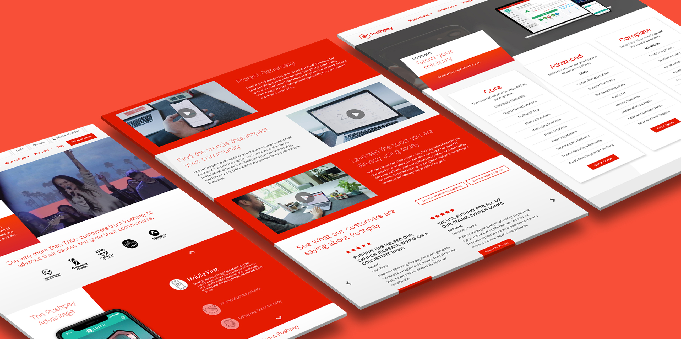
The Pushpay team wanted a site with strong editorial capabilities and rich publishing features, which led them to select WordPress for their new, unified platform. An atomic design system was developed to help the Pushpay team adhere to consistent, branded visuals and storytelling methods on the new platform. Findings from the user research and discovery phase were used to inform the site design and new information architecture to help users more easily complete tasks and interact with various important touchpoints – based upon Arrival Mindsets and High-Value Task completion.
The new atomic design emphasizes that Pushpay is a “churches and more” product with widespread non-profit appeal. Pushpay’s new branding has been well received by both churches and secular organizations alike, and the new WordPress platform and atomic design have helped the Pushpay content team more seamlessly create and publish beautiful, high-value content.
The new Pushpay platform is an example of a convergence of technologies we’re proud to work with:
- WordPress allows for simplified content authoring and management
- A Flynt framework in WordPress enables a component-based design for the site
- Pattern Lab handles the theming of each individual block and page
- A Simply Static WordPress plugin allows for the painless generation of static site content, which is then uploaded to an Amazon Web Services server and delivered to the user
Choosing WordPress for a secure, high-performing, static solution
To protect users’ credit card information and to improve site performance, Pushpay chose to implement a static site solution on their platform. A static site is a web platform that has had all of its content exported and uploaded to an Amazon Web Services server. A static solution fully decouples content from the CMS that generates it, which has several benefits:
- Speedy loading times. Because the content is already generated, the server is able to rapidly deliver pages without having to query a content database
- Security. Having all content served up as static pages that don’t interact with or integrate any back-end systems increases the platform security to protect users’ sensitive financial information
Since the site content is fully static and doesn’t use WordPress’ plugins or logic to deliver media, Amazon Web Services’ Cloud Front performs the load of delivering content based on queries. To ensure that users are able to access the Pushpay product, AWS Cloud Front has a series of rules for directing and delivering traffic. URLs with pre-programmed paths point to content stored on the AWS server, while URLs with other designated paths point to the Pushpay product.
To preserve security, users are able to access their financial and donation information only through the Pushpay product, while site content remains completely separate from any of those systems. When a user logs in to their Pushpay account through the website, they do so directly through the Pushpay portal, meaning that no part of WordPress touches Pushpay’s product.
Visit the site: pushpay.com