VisitDenmark: An entire country on one website
Admittedly, Denmark is not exactly huge. And yet the smallest of the Scandinavian countries has a lot to offer!
Anyone who thinks of the smallest of the Scandinavian countries will surely have a few associations ready: butter biscuits in tin cans, Arne Jacobsen's Egg Chair or a general feeling of proverbial Scandinavian sense of serenity: "Hygge".
The Danes themselves say about their homeland that there are seven everyday wonders that make up their small country: the food, the culture, the history, their creations, the all-round coast, the understanding of neighborhoods and the picturesque nature.
Well, many want to experience these miracles! No wonder that tourism in the small country of Denmark is booming - and has lately become one of the most important economic sectors in the country. The tourism authority has counted more than 10 million visitors since 2015 - every year! Tourism revenue was $ 7 billion in 2016, and shows an upward trend.
VisitDenmark is the country's tourism association. Its main task is the branding and marketing of Denmark as a favorable destination for holiday trips, city trips, and as the location for conferences and business meetings.
High Tech for Hygge
The portal is therefore aimed at a large number of target audiences - both internally and externally. Sounds just obivous? Right. But it becomes quite impressive when you consider the dimensions: Several hundred people work on the portal, often simultaneously. When travel bloggers, city marketers, cultural professionals, museum operators, LEGOLANDers, gastronomers, hotel operators and many more work on content for the website, which is then translated into 10 languages for worldwide audiences, this makes up for tonsvis of content.
Plus, when 3.5 million users from all over the world look at this content every month, the requirements for the tourism portal become pretty clear.
Form follows Function
When you visit VisitDenmark, all technology disappears in the background: feeds from third-party providers for the provision of events, partner lists, weather forecasts, widgets for hotel bookings. The integration of all of this data has really challenged our developers. With the desired result: All work in the back end of the site resulted in a seamless user experience in the front end.
We follow a good Scandinavian tradition when we say that technology should be useful. This is exactly the case here too: The goal of all efforts is the perfect user experience - for all target groups, on all devices, on all subpages, with all third-party solutions and in all 10 languages. Everything else had to be subordinate to that. And still come across elegantly.
After the previous version of the VisitDenmark platform was no longer able to meet the increased requirements for performance, security and user experience, it quickly became clear that a modern multisite solution was required here that offered an architecture that would withstand the growing demands.
Digital Landscapes Coast to Coast – Multi-Site Architecture for multiple Sights
Over 30,000 tourist products, events, restaurants, sights, hotels, ... - this requires a stable and scalable multisite architecture.
And more than that: The VisitDenmark portal is also used by tourist offices in 78 local destinations across Denmark, each of which publishes content for local marketing, such as
visitaarhus.com , visitcopenhagen.com and many more. Over 70 pages with well over 300 domains are used in this way.
Lightning Fast …
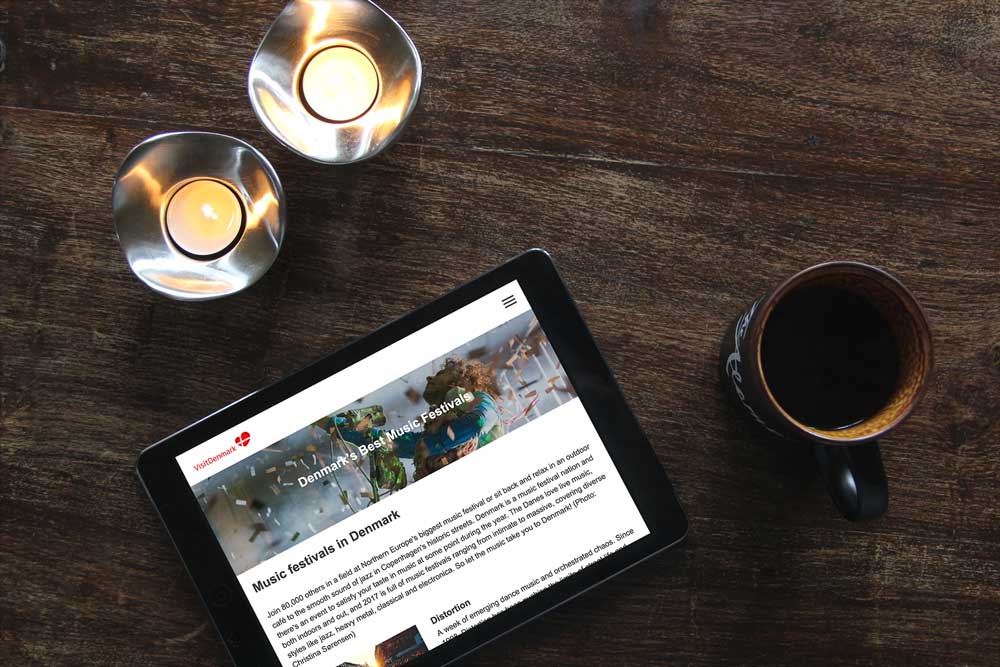
The entire platform should perform fantastically - even on mobile devices and even with a bad internet connection. What used to be a problem with the previous solution was solved with a modern architecture. The (admittedly) complex setup is based on the CMS Drupal 8.
In order to (over)achieve the requirements, in particular for fast loading times, we decoupled the frontend from its base: The website is implemented in lean ReactJS and is delivered via the Cloudflare CDN. In combination with a sophisticated multicache layer setup, implemented with Double Varnish, we slim down the resources and thus the loading times.
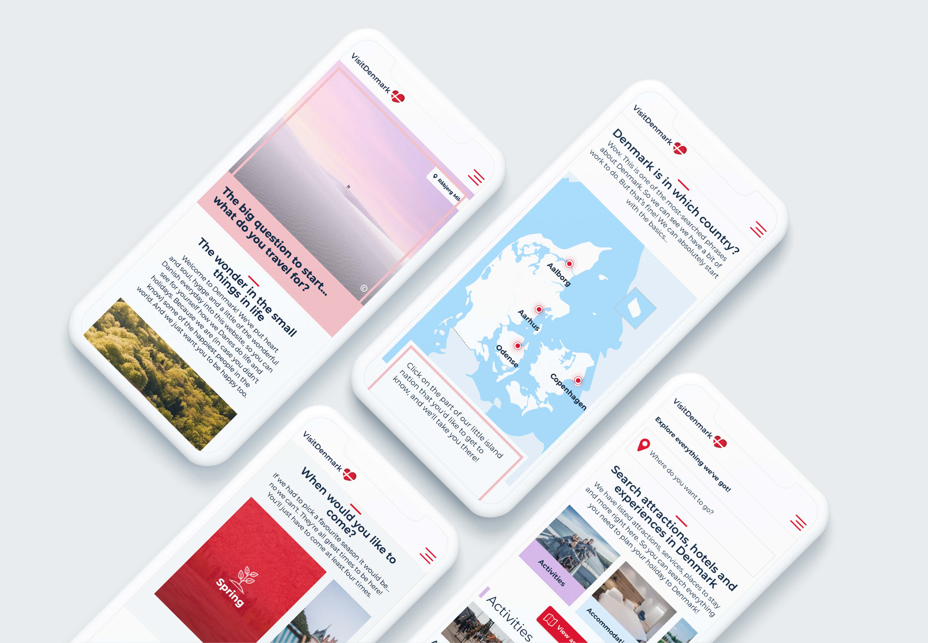
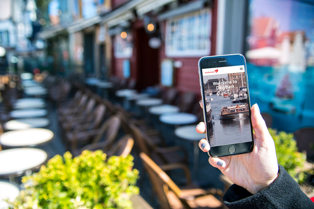
Visiting Denmark? On the phone? In the subway? No problem!
… at skåle!
Even if the ubiquitous demand for scalability often triggers certain reluctance: A multisite platform is a sustainable investment only if it gives growing internal teams flexibility and at the same time can intercept increasing website traffic.
The VisitDenmark platform is delivered worldwide via a lightning-fast scaling content delivery network. Internal scalability is achieved, among other things, by the CMS architecture, in which data storage and processing are strictly separated (decoupled CMS). This means that the work on the portal can be carried on many shoulders - worldwide.
Safety First
The decoupled CMS architecture also benefits data security: website data, user data, and admin data are stored in physically independent layers.
On the server side, the hosting provider Sentia takes care of website security. SSL is used on both the CDN and server side. Each with its own certificate, so that communication between the web server and distribution network remains completely secure.
FFW, as a Drupal partner, keeps everything clean on the CMS side. We regularly apply all necessary security patches and keep the CMS core constantly up to date.
Webforms are protected against unwanted access with a Captcha variant.
Experience Denmark!
The creative process started with the development of a visual concept and proceeding with a concept for the website and subsequent detailed design.
The process of developing both information architecture and design took place in very close collaboration with VisitDenmark's project group in 5-day design sprints, each ending in wireframes and design elements that could be tested internally and externally. The division of the process into design prints allowed both us and VisitDenmark to be able to focus on the details, while at the same time having the opportunity to keep an eye on the overall experience of the product. FFW planned and facilitated design sprints.
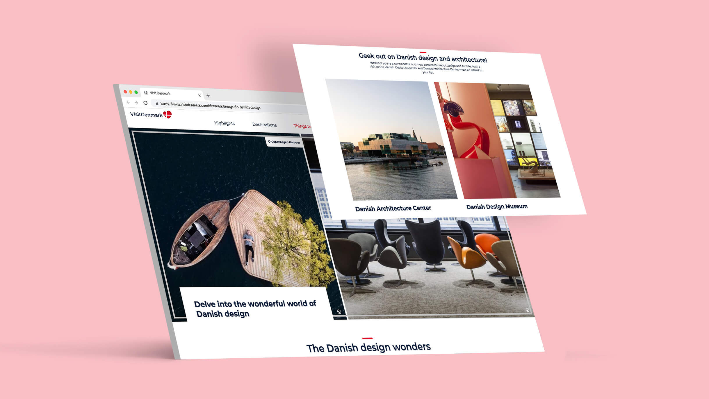
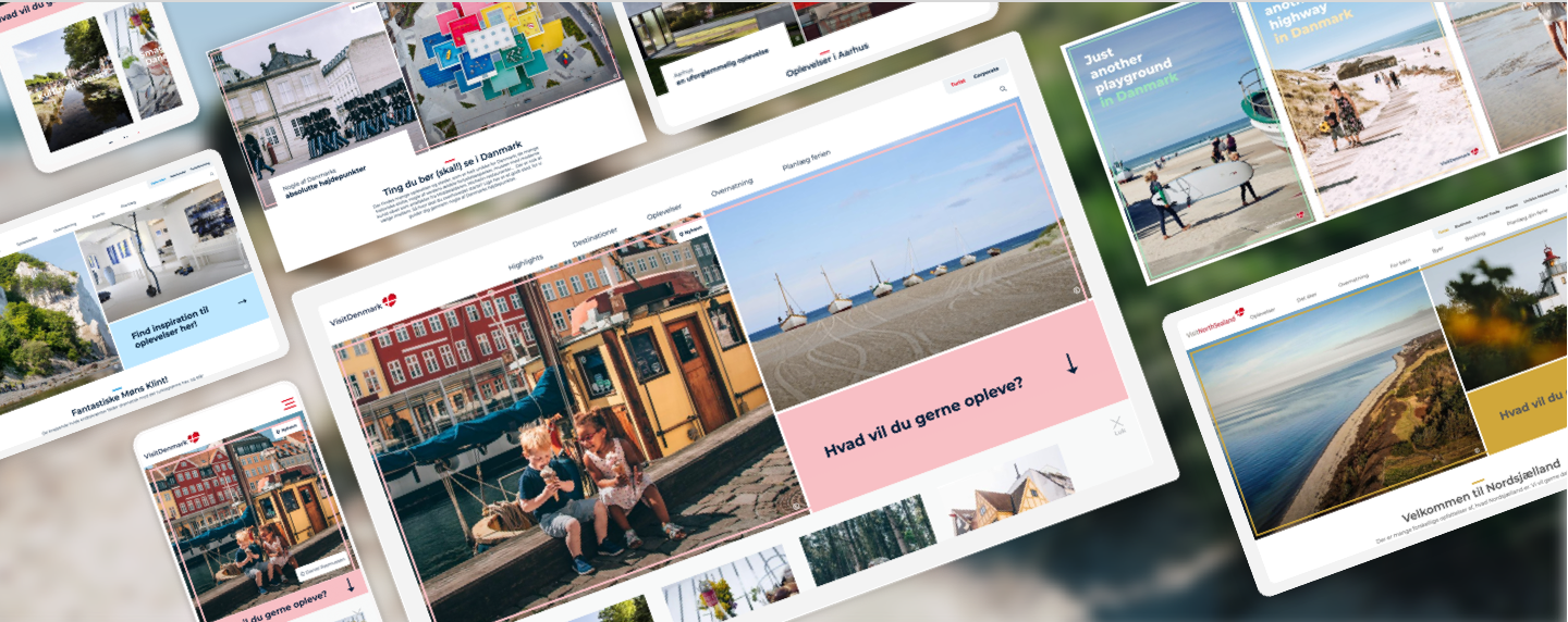
The redesign of VisitDenmark's new site is far more contemporary and visually appealing with great pictures and inspiring videos of Denmark's gems. At the same time, the site has become more user-friendly and much faster, making navigation easier for visitors.
In connection with the redesign and design process, FFW conducted several user test during the design and UX process, and also as a follow-up, 6 months after launch.
Internal Affairs
Content editors find it easier than ever to work on Denmarks new appearance: new pages are easier to add and edit, content workflows are automated as far as possible. Content templates for different applications and requirements give great flexibility and at the same time keep creation in check - for a consistent and sophisticated appearance.
The result: As sleek as the page appears to the visitor, is the work behind the scenes - simple and self-explanatory. Gone are the days of complex and time-consuming training phases and onboardings.
Content creation comes also with an intuitive approach for CMS newbies. Integrating call-to-actions, social feeds or other third-party content is child's play. Nothing is rotten in the state of Denmark: thanks to the revision system, even major blunders stay excusable.
VisitDenmark keeps the full control over content and cost and can edit everything completely independently.
To Godt Samarbejde!
All relevant stakeholders - from public transport to museum marketing - can work directly on/with the VisitDenmark portal. This is made possible also by outsourcing some essential functionalities to third-party systems - and the seamless integration of these into the central CMS:
GuideDenmark
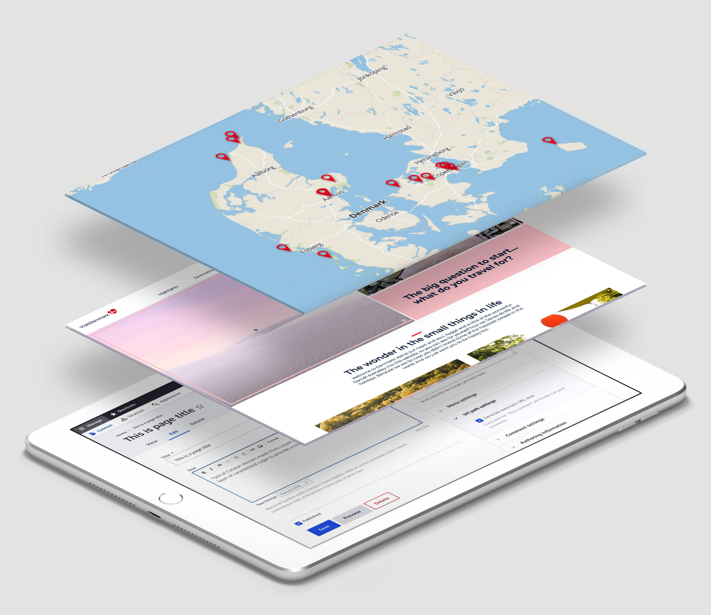
With GuideDenmark - the central database for tourism in Denmark - over 30,000 tourism products are seamlessly integrated into the VisitDenmark portal. Of course with A seamless maps integration (with open source maps provider MapTiler) and a easy-to-use search functionality.
Here visitors can find relevant information on a variety of things such as accommodation, sights, activities, events and much more throughout Denmark.
All products in GuideDanmark are presented with high quality pictures and are described in several languages and are maintained by the local travel agencies and tourism authorities.
The information is not only used for VisitDenmark, but is also part of most local tourism websites and can also be used by other parties.
Crowdriff
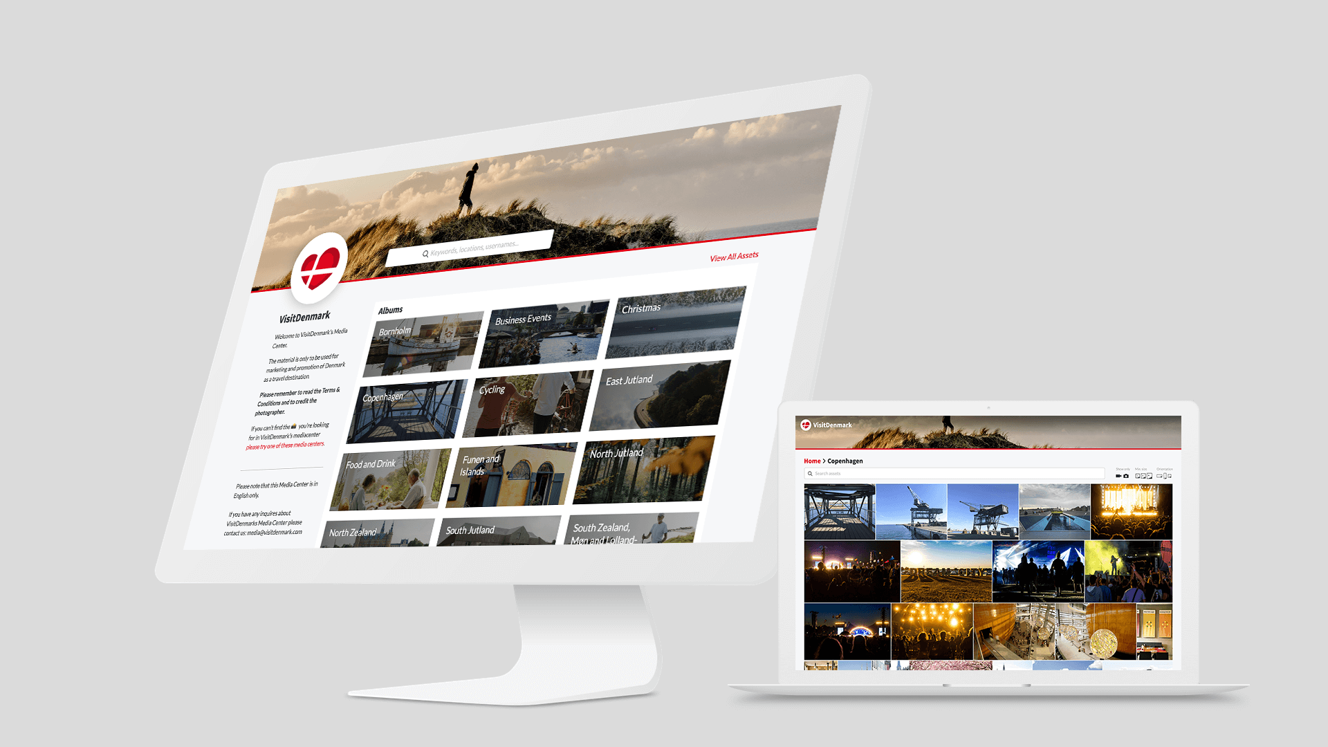
The Crowdriff image database functions like an asset management, which scores with both extensive social media integration and a seamless Drupal interface.
Content editors can generate Drupal thumbnails and generate all image variants here - the system ensures that there is no loss of performance, for example due to improperly formatted image data or poorly edited metadata.
The image database is also aimed at tour operators, bloggers and everyone who wants to make Denmark better known in the rest of the world.
All Roads Lead to ...
Essential for travelling are: maps. As an integral part of the old VisitDenmark page, the maps should also find their way on the new website. Of course, without overcharging the Danish taxpayer! Again, we relied, to everyone’s great approval, on MapTiler’s open source maps solution, that could be integrated just perfectly into the Website.
Search … and find!
You can’t speak of search and be silent of finding. The on-site search on VisitDenmark takes into account the variety of information, providers and target groups and meets a corresponding wealth of requirements.
The implementation of Apache SolR is therefore optimized for all 10 languages. And more: webmasters, marketing and editorial teams and / or translation service providers in the individual countries can easily edit best bets and sponsored search terms via the CMS and also enter typical synonyms and common typing errors. Faceted search, autosuggest and quick indexing are of course also on board.
