Smile Train
Client
Smile Train is the world’s largest cleft-focused organization, with a model of supporting surgery and essential care. Creating a platform with their noble vision first, that appealed to their spectrum of audiences was imperative.
Challenge
Incorporating Smile Train’s vision into any strategic decisions was critical. The new platform needed a governance and architecture model to influence future sites and make content management much easier for their team.
Impact
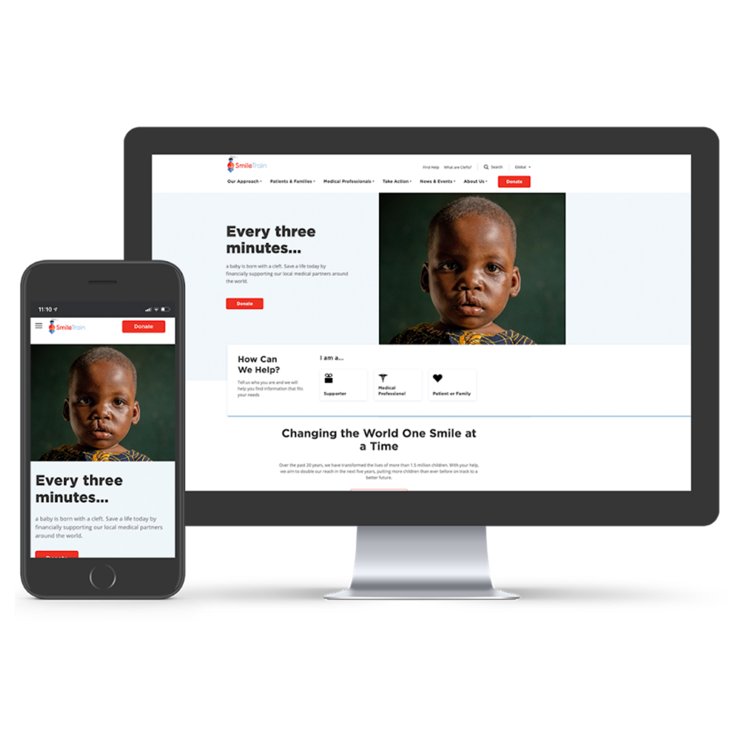
A faster, unified, and mobile optimized platform. Donors, doctors, supporters, patients and families can easily find resources or paths to involvement. Smile Train’s team can create and manage content quicker than ever.

Safe and quality cleft care for over a million children globally
Over the last 20+ years, Smile Train has supported safe and quality cleft care for 1.5+ million children. Smile Train aspires to be the gold standard for ensuring that people around the world have access to information and help surrounding cleft care, and requires a website platform that can help them achieve this.

Their message needs to spur action and provide resources for a wide variety of audiences, including donors, patients, caregivers, fundraisers, volunteers, and medical professionals. Smile Train’s audiences are spread throughout the world, with an emphasis on serving patients and families in low and middle income countries. This created an even greater need for Smile Train’s site to be mobile-friendly and accessible.

Inspiring and growing a community to create more smiles everywhere
Smile Train wanted a platform that could help inspire and grow a community around their noble vision, by showcasing knowledge, sharing resources, and demonstrating impact. They sought FFW’s help to revamp their flagship site as a cornerstone to a new, unified, mobile-optimized, and global Drupal 8 platform where all their audiences could become involved.
Client Objectives
- Lay the foundation for future success
- Put Smile Train’s cleft-focused vision first
- Get Smile Train’s team excited about the launch, rather than frustrated
- Tailor messaging for Smile Train’s diverse audiences
- Alleviate multi-site chaos
Solutions
- Fully aligned and collaborative discovery process
- Information architecture tailored to user’s needs
- Content types streamlined, and reduced from 49 diverse types to 7 highly-flexible types
- Optimized structure with common code for fast updates
Streamlining content and reducing the number of content types created a more simplified content editing experience, while optimizing the site’s structure allowed for easily customized features. Smile Train and FFW’s discovery process was thorough and inclusive for their team. This allowed us to deeply understand the project objectives and how to keep Smile Train’s cleft-focused vision and their audiences at the forefront throughout the strategy.
Fully aligned discovery process
Smile Train had a strong understanding of its needs, wants, and organizational challenges, which created the ideal environment for a discovery that was highly engaging and collaborative. The discovery was focused on aligning on and clarifying project objectives.
Information architecture tailored to user’s needs
Our workshops around personas and information architecture provided valuable insights around who Smile Train’s five key audiences are and how to best message to them. This information laid the groundwork for grouping content and creating a sitemap to help users more easily find and identify content that fits their needs. The platform exists to serve both users and the organization: by allowing users to access the necessary cleft information, and providing the means for Smile Train staff to update the site, while maintaining security, accessibility, and reliability of the site.
Simplified content
Content types were streamlined and reduced from 49 diverse, and sometimes overlapping types, to 7 highly-flexible types. More than a dozen components—such as galleries, cards, tabs, and listings—were implemented to allow editors to remix key pages with less friction. Content was localized to allow Smile Train users in different regions to get relevant content in their language.
Optimized structure
Using best practices, FFW developers configured the site to reduce the friction of deploying or changing features on a per-site basis. With multiple sites, using common code now allows all regional sites to share code and make distributed updates fast and reliable.
A platform to support Smile Train’s vision and improve the world
With such an important cause that’s positively impacting the lives and smiles of children across the world, Smile Train’s platform needed to be built with the highest standards of today, and withhold for the needs of the future. Smile Train’s site now is faster, more responsive, and simplified for users and content editors alike, yet also more robust. It lays the foundation of continuous improvements for Smile Train’s platform for years to come that can extend to all international sites. Now if there’s an enhancement on the US site, everyone can take advantage of it.
Exemplifying a noble mission, better connecting with supporters
Users are enjoying the near instantaneous speed of Smile Train’s new platform and the vastly improved mobile experience. There were previously pages and functionality that simply didn’t work on mobile. Now, it’s much easier to find sections in the mobile navigation and the search capabilities are intuitive and logical.
Smile Train’s internal team was included throughout the discovery process, and it’s shown through their receptiveness of the new site. There’s a near universal understanding of why things were built a certain way, and an appreciation of the simplicity and functionality of it. People had their voices heard and felt connected to their sections of the site.
To learn how you can support Smile Train, visit: https://www.smiletrain.org/get-involved
Let's eliminate content chaos and put smiles on your team's faces
Related cases
WomenLift Health Case Study

Autodesk Design Academy

LUSH Case Study
